Stakeholder Engagement
|
Graphic Design
|
PR & Media Management
|
Brand Strategy
|
Project Management
|
Website Refresh
|
Brand Development & Design
|
Market Research
|
Email Marketing
|
Values Development
|
Stakeholder Engagement | Graphic Design | PR & Media Management | Brand Strategy | Project Management | Website Refresh | Brand Development & Design | Market Research | Email Marketing | Values Development |
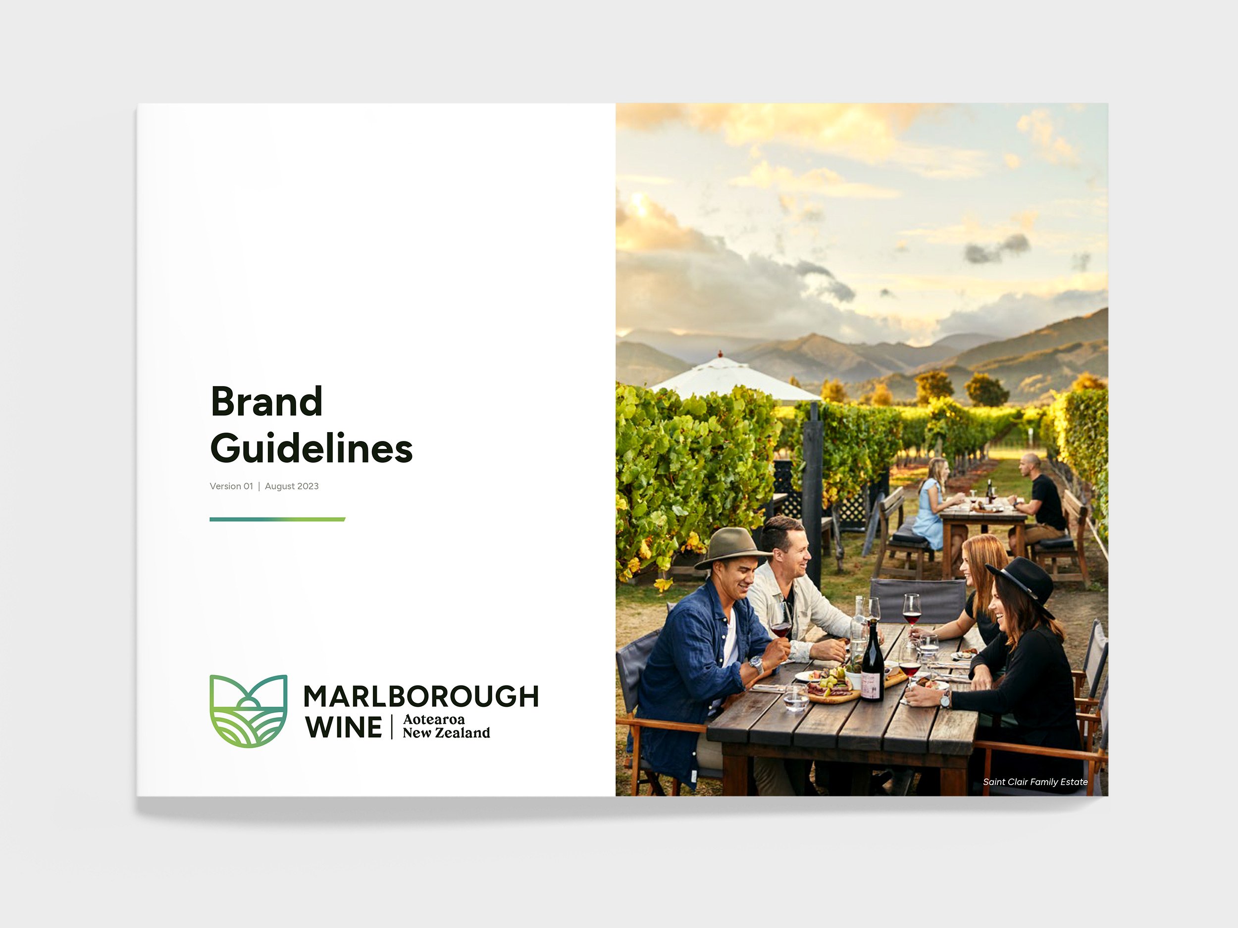
Marlborough Wine
A fresh identity for an iconic region
Marlborough wine is the perfect fusion of people, place, passion and perseverance.
As the region that first put New Zealand wine on the world map, they continue to define the pulse of wine in Aotearoa. They are fearless and forward-looking. They have earned their place in people’s hearts, and intend to do so for generations to come.
In celebration of the industry’s 50-year milestone, and to provide the industry with a marketable brand mark the region could own, Publik worked with the Marlborough Winegrowers Association (Wine Marlborough Ltd) to redefine the Marlborough wine region’s mission, vision and values. This resulted in a toolkit growers and winemakers could use to help promote their offering and the wider region, as well as refreshed brand guidelines and assets that better express the Marlborough Wine identity and voice.
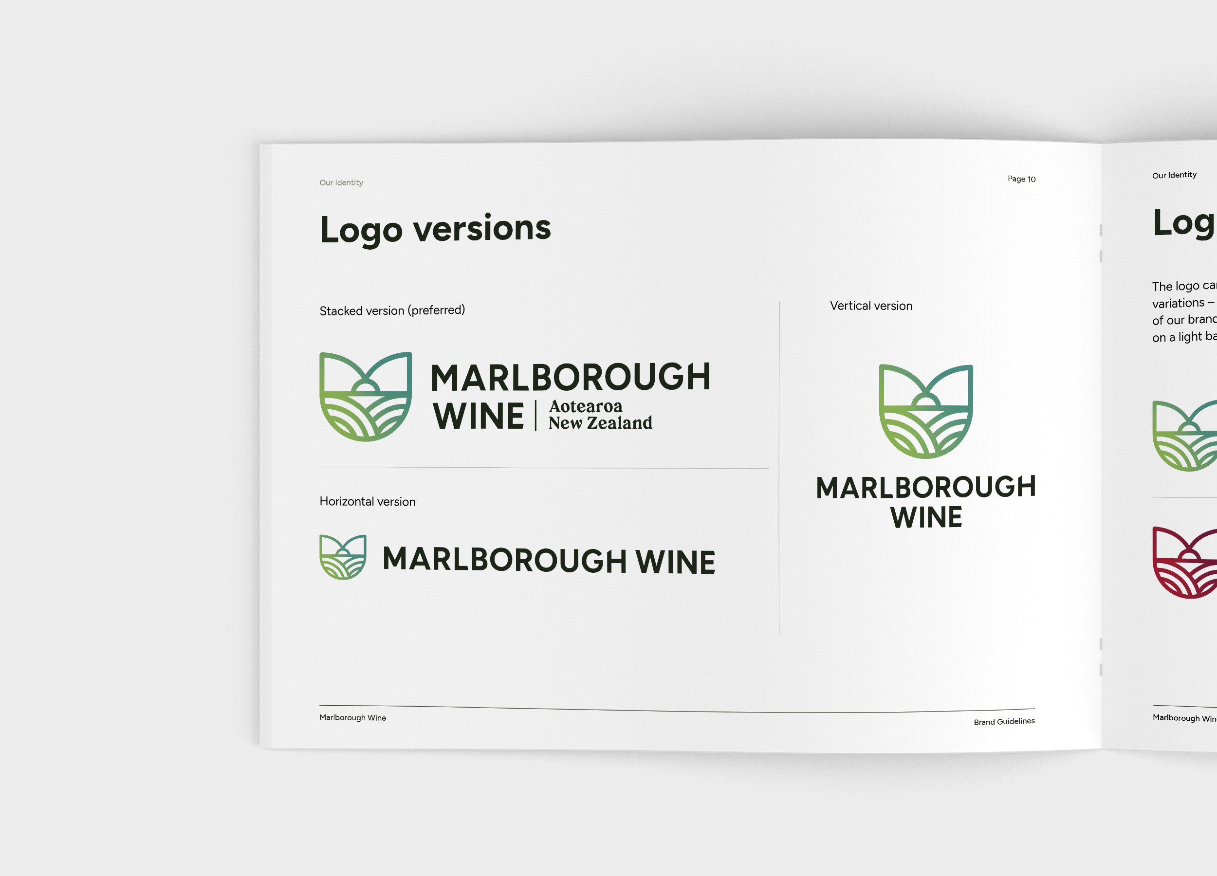


Building a strong narrative from the start – behind the logo
The subtle heart-shaped curvature is a nod to the industry’s shared vision statement to “…forever earn our place in the hearts of our people…”
There is a feeling of warmth, inclusion and protection as the shape at the top of the device creates an M that wraps around and encapsulates all that is Marlborough, protecting what is held dear.
The tips of the brand mark not only fall into the centre to represent the ‘hole in the clouds’ the Marlborough region is synonymous with, but the peaks of this shape also represent their mountain ranges that help protect and shape Marlborough’s enviable wine-growing climate.
Gradients help express the dynamic force that is the industry. It creates energy and movement – much like what is encapsulated within the industry.
The curving lines at either side of the bottom of the brand mark represent the valleys and rivers. On the left are the Wairau, Waihopai and Awatere rivers. On the right are the Awatere, Wairau and Southern valleys.
The use of lines throughout the graphic recognises the brand work and position of the Marlborough region in their identity – this is a subtle reference to the concept of ‘story lines’ with the inclusion of this representation. Understanding that there are many stories and people that make the industry what it is, each with a role to play.
Overwhelmingly it was recognised that what makes the wine special is the place. You can taste it. It is palpable. We have encompassed all of these elements – all of Marlborough – in a shape representative of a glass.


Celebrating 50 years
When the first grapevines were planted in 1973, few would have predicted Marlborough’s rapid ascent to become one of New Zealand’s preeminent – and internationally renowned – wine-growing regions.
In 2023, Marlborough Wine celebrated 50 years of what many refer to as Marlborough’s official beginning as a wine region.
Coincidentally, 2023 also marks 150 years since Marlborough’s first vineyard of Muscat was planted in 1873.
Alongside the new Marlborough Wine brand, we developed a 50-year celebratory device and assets as well as a range of activations for stakeholders.

Whatever it is, the way you tell your story can make all the difference.